Table of Contents
- Dataset Overview
- Hands-On Data Analysis using Python
- Data Visualization
- Extracting different observations
- End Notes
Dataset Overview
In this small yet interesting project, we will be performing various tasks like data cleaning, data resampling, hypothesis testing, Data visualization in different ways.
So, Metrological data is a weather dataset. many sites provide the historic dataset on many meteorological parameters such as pressure, temperature, humidity,
wind speed, visibility. The dataset we have taken is easily available on Kaggle and you can simply download it from here.
Let's get started with our analysis and present our results.
Step-1) Import all the required libraries
import numpy as np
import pandas as pd
import matplotlib.pyplot as plt
import seaborn as sns
import warnings
warnings.filterwarings("ignore")
Step-2) Load the dataset
data = pd.read_csv('weather_data.csv')
data.shape
(96543, 12)
Step-3) Have a basic look over data and preliminary statical analysis of data
Now, let's take a copy of data into any other instance so, that we will not make any kind of changes to the original data.
Step-4) Check the Anomalies in Data
If any kind of irregularities is found in data like wrong data type or missing value then we will try to make it correct.
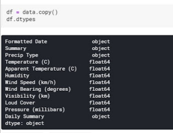
Now, as we can see the Formatted Date column at first number has data type as an object, rather it is datetime. so let's make it correct.
Step-5) Exploratory Data Analysis
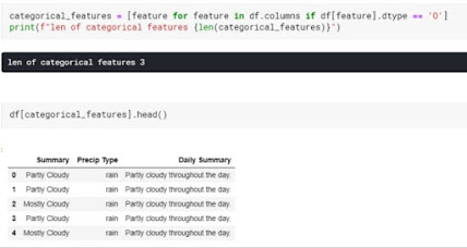
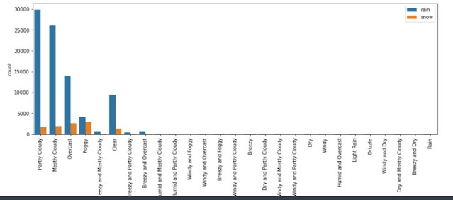
The Daily summary column is of no use, so simply drop it out. Let's explore the remaining 2 categorical features, what can we see.
So, by seeing the above observation, we can say that the temperature will fall down when there will be rain or snow.
Summary concerning Precip Type
After Resampling
Relation between Temperature and Humidity
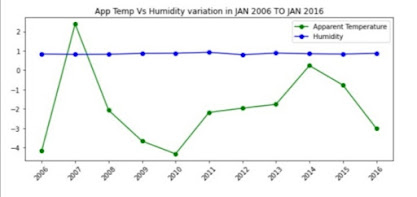
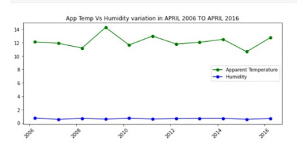
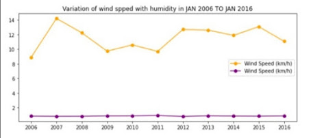
The Problem Statement suggests that to check the variation of humidity of all the 10 years(2006-2016). So, let's explore the graph of some of the months to understand the variation of temperature concerning humidity.
Function To make the plot for January month
let's take one more month of April
Observations
- concerning humidity, every month changes only a little bit, in 2009 temperature is at a peak, but the humidity remains constant as usual.
End Notes
Learning is an ever continuous process and its uses come in front of you when you do hands-on practice and apply its application in the real world to find the best out of it. so, you will only learn when you will practice all these codes in your notebook. so go and play with the dataset. I have uploaded all the analysis in the Kaggle notebook which you can use, copy and play with it. the link for the notebook is Analysis of Metrological Data.





Very nice visualization and you have expressed the outputs very well.
ReplyDeleteVery nice project.
ReplyDelete